← All work
Branding · Web Development · Identity
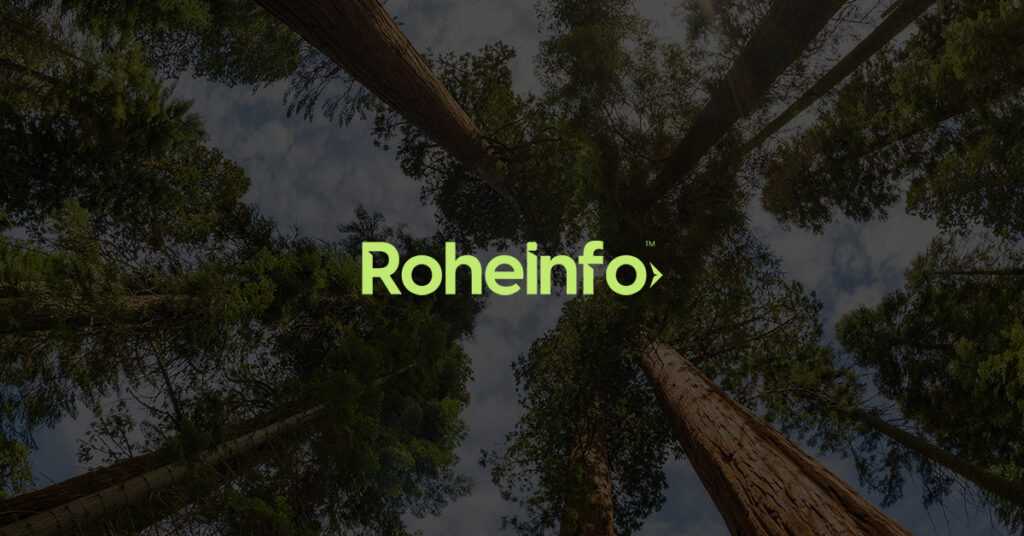
Roheinfo branding & website
Branding and website for an Estonian environmental nonprofit making greener living feel approachable rather than preachy.
Challenge
Roheinfo's premise is simple: a greener lifestyle shouldn't feel like a moral test you keep failing. Lowering your carbon footprint is something anyone can opt into — at the scale that fits their week, their budget, their headspace.
The challenge was to build a public face for that idea without leaning on the visual shorthand the sector usually defaults to. No melting-glacier hero images, no guilt, no green gradients pretending to be hope. The brand had to feel calm, credible and genuinely useful — closer to a good newspaper than a campaign poster — while still holding together across awareness campaigns, educational content, events, consulting, and on-the-ground clean-up work.
Approach
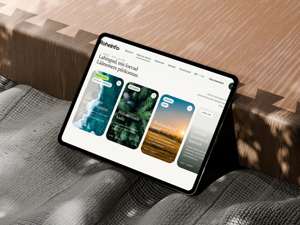
The brand is anchored in editorial typography. Newsreader carries the headlines, with italics reserved for the moments the voice softens. Geist handles the interface, Geist Mono the metadata and small print. Together they read more like a considered publication than an NGO microsite — which is the point. People take reading seriously; they scroll past slogans.
The palette is pulled straight out of the Estonian landscape Roheinfo works in: deep forest green, mossy lime, a warm off-white that behaves like daylight on birch. No alarm-red, no climate-tech cyan. The lime is used sparingly — the way you'd notice a single new sprout against dark bark — to mark calls to action and shifts in rhythm.
Every section had to earn its place. Long paragraphs were cut to the line that mattered. Stock photography was replaced with monospace placeholders and quiet SVG marks. Decoration that didn't carry meaning was removed entirely, leaving more room for the work itself.
Solution
A full identity system and website built around a single idea: information about living lighter on the planet should be easy to read, easy to act on, and free of the theatrics that usually surround it.
Delivered: brand strategy and positioning, visual identity, typographic system, tone of voice guidelines, and a fully built website covering Roheinfo's five focus areas — campaigns, education, events, consulting, and direct-action clean-ups and rescues.
Results
Roheinfo launched with a clear, recognisable presence in a sector where most organisations look interchangeable. The editorial tone gave the team something to write into rather than against — campaign pages, event listings and educational pieces could all sit comfortably under the same roof without needing a fresh design pass each time.The site became a working tool: volunteers shared individual articles rather than just the homepage, partner organisations referenced Roheinfo's pieces in their own materials, and the consulting arm started receiving inbound enquiries from companies that had only ever seen the public site. The brand has held up without a refresh since launch — usually a sign the foundations were the right ones.
Visual system
Palette
Forest
Moss
Sprout
Birch
Ink
Typography
A quieter kind of urgency.
Clear, calm, unfussy reading.
Dates, labels, small print.
Process
01 / Discover
Listening & landscape audit
Sat down with the Roheinfo team to understand who they actually wanted to reach — and looked hard at how every other environmental org in the region was already talking.
02 / Define
Positioning & voice
Settled the brand on plain-spoken, editorial, and quietly confident. No alarmism, no jargon, no halo.
03 / Design
Identity & system
Built the typographic system, palette, and component library — every element tested against the question "would this still feel right in five years?"
04 / Build
Website & handover
Developed the site, wrote tone-of-voice guidelines the team could actually use, and handed over a system flexible enough to grow with the work.
Gallery