← All work
Branding · Identity
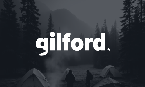
Gilford - Branding
Brand identity for Gilford Camping, a California hiking and outdoor apparel brand built for weekends on the trail.
Challenge
Gilford Camping makes hiking and outdoor apparel out of California — gear built for people who actually spend weekends on trails, not just commuting in technical fabrics. The category, though, is loud. Every outdoor brand seems to be either shouting about peak performance or selling a sepia-toned daydream of the wilderness, and most of them lean on the same visual vocabulary: mountain silhouettes, compass roses, weathered serifs.
The brief was an identity that felt at home on a trail in the Sierra Nevada without resorting to any of that. Confident enough to hang on a rack next to the established outdoor names, warm enough that it didn't read as another piece of gear-tech kit, and distinct enough to be recognisable on a hangtag from across a shop floor.
Approach
We took the brand away from peak-bagging aesthetics and toward something closer to how people actually experience the outdoors in California — long, low light, dry grass, oak shadows, the coast on one side and the mountains on the other. Less summit, more weekend.
The identity is built on a sturdy wordmark with a single quiet character detail that nods to a horizon. The palette pulls from the landscape itself: a deep base tone, a sun-bleached neutral, and a warm accent that reads like late afternoon rather than a sports drink. Typography stays restrained — confident sans for the wordmark, a readable workhorse for everything else, and a mono used sparingly for product specs and care labels. No outdoor-brand clichés. No weathered textures pretending to be authenticity.
Solution
A full brand identity system for a California outdoor apparel brand — designed to work across product tags, woven labels, packaging, retail signage, e-commerce and editorial campaigns.
Delivered: primary wordmark and supporting marks, full lockup variations, colour system, typographic pairing, tone of voice guidelines, and a usage manual covering apparel labelling, packaging and digital applications.
Results
Gilford Camping launched the new identity across its first product run and direct-to-consumer site. The brand reads consistently from the hangtag on a jacket to the homepage hero — which, for an apparel company building shelf presence and online recognition at the same time, was the whole point.
The team has reported that the identity has given the brand room to grow into new product categories without needing a rework — base layers, accessories and seasonal capsules all sit comfortably under the same visual roof.
Visual system
Palette
Bark
Oak
Late Sun
Linen
Ink
Typography
Heavy, rounded, quietly friendly.
Clean reading at any size.
Sizes, materials, fine print.
Process
01 / Discover
Category & competitor audit
Walked the outdoor apparel landscape — from established US heritage brands to newer technical labels — and identified the visual ground most of them were standing on.
02 / Define
Positioning & voice
Anchored Gilford Camping in California weekends, not Himalayan expeditions. Set the brand voice as warm, plain-spoken and quietly competent.
03 / Design
Identity & system
Developed the wordmark, supporting marks, palette and typographic system, testing each at hangtag scale and storefront scale.
04 / Deliver
Guidelines & rollout
Packaged the system into clear brand guidelines and supported the team through the first product launch, packaging run and site build.
Gallery